






Card one
tagsrender as pills
The description is required on this block — a card without one is a tile, and tileGrid already does tiles.
Card linkProdukte und Kollektionen
Beliebte Marken
Produkte und Kollektionen
Beliebte Marken
Produkte und Kollektionen
Beliebte Marken
Produkte und Kollektionen
Beliebte Marken
Block reference
The pinned page lead. Only ever the FIRST block: the renderer gives a leading videoHero a fixed parallax layer the page scrolls over, which is also why it's the one block a grid cell can't hold. video.desktopUrl is required — a phone gets mobileUrl or the poster, never the desktop encode. `height` picks how much of the screen it fills (full / tall = 90% / medium = 75%) and `position` is the full 3x3 grid; this one is `center-right` at `tall`, which is healf.de's masthead. A right-positioned block keeps LEFT-aligned text unless `textAlign` overrides it.
One rendered example of every block the page builder offers, generated by apps/cms/src/scripts/seed-sink-page.ts. Editing this page by hand is pointless — the next run overwrites it.
Each heading names the block's slug and the settings used to compose it, so you can find the same values in the admin. Where a setting changes the layout enough to matter, the variants appear next to each other: tileGrid three ways, grid two ways, pillList two ways.
This block is richText — a Lexical field with no settings at all. It renders as a centred reading column.

Tall renders the background at its natural height with the title centred over it; the scrim darkens the photo and forces white text so any image stays legible.
Block reference
01 variant: left02 size: standard03 metaItems replace the description
Healf Expert
The live curation-expert header. Pills sit BETWEEN the name and this paragraph, the column narrows to 660px and centres, and unlike every other hero the description still prints alongside the meta items. Everything else about the block is unchanged — it is the same hero, wearing its third shape.
Above: grid — columns: 2, holding two collectionCard children. This is the homepage's pattern, used twice there. The grid owns layout, the children own content; children render 'nested', dropping their own page gutters so they fill the cell instead of re-containing themselves.
Above: grid — columns: 4, theme: dark, holding four collectionCard children. The /pages/brands wall is this exact shape with twenty-six of them. collectionCard is the only block that exists solely to live in a grid — it's absent from the top-level block list, so a grid is the only place you can reach it.
Nothing on the image; label and optional description sit below it. The expert grid on /pages/curation is this. Setting `number` switches the heading to the small-index treatment you see to the left.

Rose Ferguson
description renders under the label

Tara Swart

Jamie Clements

Matt Maruca
Near-square image with the label top-left and chevron bottom-right, then the caption and a pill button below it. The button only appears when a tile sets ctaLabel — the other two styles ignore that field. These are the Zone/Source/Curation cards on /pages/about-us.
Block reference
An editorial card set: each card takes an image, a title, a tag row and a required description. Unlike tileGrid the cards are content-shaped rather than a photo wall, and each carries its own link CTA.
The description is required on this block — a card without one is a tile, and tileGrid already does tiles.
Card link
Cards keep their aspect ratio across breakpoints.

Three is the usual count; the grid reflows to two-up then one-up as the viewport narrows.
A horizontally scrolling row. Overlay uses a square image with the title on top of it; the sibling setting `caption` gives a 2:3 image with title and description below instead.
“Dots auto-rotate; the `tabs` setting instead renders a manual tab row using each slide's tabLabel.”
“Slides carry an image, a category, a name and role, the quote itself and an optional description and CTA.”
Rose Ferguson
“With autoplay off, dots become manual paging — the two settings are independent.”
Tara Swart
The heading sticks while the cards scroll past it. Tall gives each item a numbered 2:3 image with title and description below; `horizontal` instead lays each item out image-left, text-right.
Block reference
`number` is per item, so the sequence is yours to set.
An item with an href becomes a link.
The heading stays put until the last card clears it.
Media is optional per item, which is the difference from cardGrid: steps are a sequence, so they read fine as text alone.
Items render in order with their index shown.

An image per step is optional.

This step has no media at all — the row still balances.
The layout live uses for the curation experts' non-negotiables band. Numbering is dropped on purpose: at 2-4 columns the items are a SET, not a sequence, so an ordinal would assert an order that isn't there. One column on phones, two from md, the full count from lg.
Item headings step up to 24px here.
No weight utility — live computes 400.
Media is optional in this variant too.
This one has an image, to show the row still aligns.
ratingText is the authored fallback — a live Trustpilot reading for the market replaces it
Reviewer name
Reviews scroll as a marquee
The card strip duplicates itself so the loop is seamless, and pauses on hover. With bgImage set the cards go glassy over the photo; without it they sit on the theme surface.
Second reviewer
The rating line is three-tiered
Live per-market Trustpilot score first, then this block's ratingText, then the legacy static line from Reviewee — so a market never shows another market's numbers.
Reviewer name
Reviews scroll as a marquee
The card strip duplicates itself so the loop is seamless, and pauses on hover. With bgImage set the cards go glassy over the photo; without it they sit on the theme surface.
Second reviewer
The rating line is three-tiered
Live per-market Trustpilot score first, then this block's ratingText, then the legacy static line from Reviewee — so a market never shows another market's numbers.
Block reference
A single full-width promotional band. Unticking `enabled` hides it without deleting it, which is how a campaign is parked between runs.

A media half beside a numbered display heading and body copy, sitting directly on the section surface with no card. The editorial sibling of collectionSpotlight, which puts its text on a cream card and can append a product row.
Blank lines in the body become separate paragraphs, as here. Because this block has TWO media entries it renders as a fading carousel with prev/next arrows — a single entry renders a static image instead.
Value and label per entry, nothing else. Deliberately text-only: it's a rhythm break between two image-heavy bands.





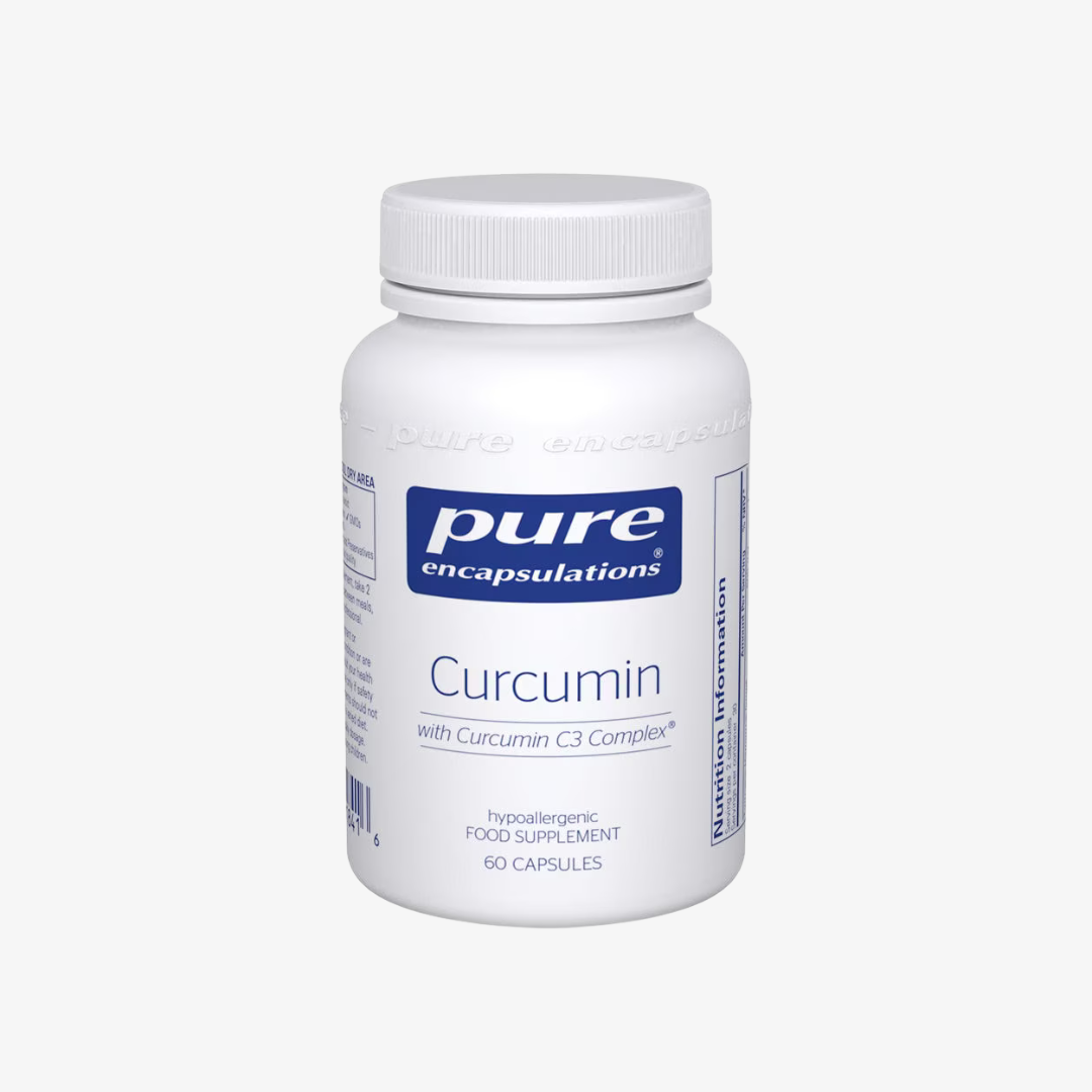

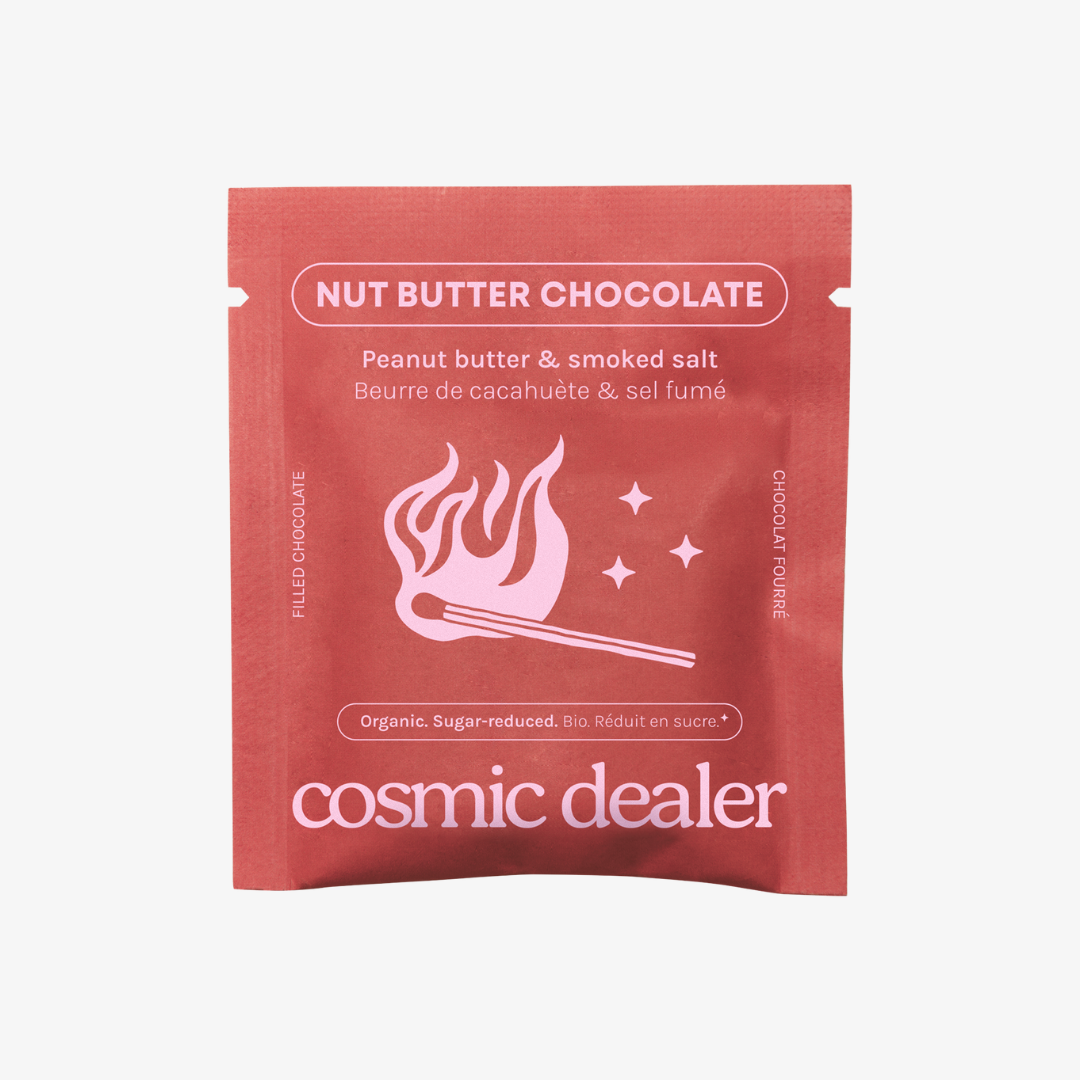
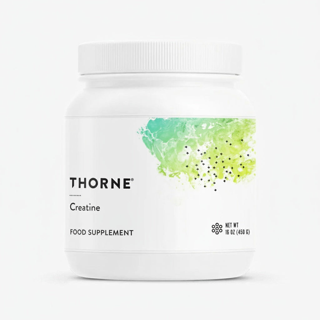
A cream/ink card beside an image, plus an optional product row underneath drawn from `source` — bestsellers here. splitFeature above is the same split without the card or the products.




408 Ergebnisse



















The founder of DAYE isn't just interested in period care. She wants to completely change the way we approach health and wellbeing for women.
Mehr lesen-3.jpg)
From dehydration and migraines to muscle tension and caffeine withdrawal, a GP and nutritionist explain what different headaches feel like, why they happen, and the evidence-backed ways to relieve them without popping painkillers.
Mehr lesen
Here's exactly how the legendary music producer finds inner peace using Transcendental Meditation.
Mehr lesenScrollable link pills with chevron nav that only appears once the row actually overflows. Each pill can carry an href.
The same block as decoration: two auto-scrolling, edge-faded rows, centred title and intro. Hrefs are ignored here — the /pages/curation ingredients band is this variant.
Collapsible rows with Lexical bodies, so an answer can hold links and lists. `full` instead spans the band, which is what the Help Centre FAQ uses.
Narrow keeps a reading column, which suits a short FAQ beside other content. Full spans the band for a long, standalone list.
Block reference
The Help Centre tabs and accordion over the shared faqs collection. Leaving categories empty shows every tab, which is the usual choice; naming some limits it, and a chosen tab with no questions in the visitor's market is dropped rather than shown empty.
Sobald du deinen Tracking-Link per E-Mail erhältst, kannst du deine Lieferpräferenzen auf der Website des Versanddienstleisters anpassen. Verpasst du die Zustellung, informiert er dich über einen erneuten Zustellversuch oder eine Abholmöglichkeit in deiner Nähe.
Aktuell liefern wir ausschließlich innerhalb Deutschlands.
Innerhalb Deutschlands liefern wir wie folgt:
• Kostenloser Standardversand ab einem Bestellwert von 75 €.
• Bei Bestellungen unter 75 € fällt eine Versandpauschale von 4,99 € an.
• Die Standardlieferung erfolgt in der Regel innerhalb von 2–4 Werktagen.
• Versand aus der EU, keine Zollgebühren
Bei Fragen erreichst du uns unter team@healf.de.
Die Lieferung innerhalb Deutschlands dauert in der Regel 2–3 Werktage ab Vertragsschluss. Bei Fragen melde dich gern unter team@healf.de.
Wir empfehlen, deine Sendungsnummer zu prüfen, um den aktuellen Status deiner Bestellung zu sehen. Dauert die Lieferung länger als die üblichen 2–3 Werktage, melde dich bitte bei unserem Kundenservice-Team unter team@healf.de – wir helfen dir gern weiter.
Es tut uns leid, falls ein Artikel beschädigt bei dir ankommt. Melde dich in diesem Fall innerhalb von 48 Stunden nach Erhalt bei unserem Kundenservice-Team unter team@healf.de und schick uns ein Foto und eine kurze Beschreibung. Wir kümmern uns so schnell wie möglich darum.
Wenn du deine Lieferadresse ändern möchtest, melde dich bitte so schnell wie möglich bei unserem Kundenservice-Team unter team@healf.de. Wir versuchen, deine Daten noch vor dem Versand zu aktualisieren. Da wir zügig arbeiten, kann es aber sein, dass deine Bestellung schon vorbereitet ist. In dem Fall kannst du über den Tracking-Link, den wir dir senden, deine Lieferoptionen anpassen – etwa die Umleitung an einen Abholpunkt in deiner Nähe. Klappt das nicht, melde dich bei uns, und wir finden gemeinsam eine Lösung.
Gerne – wir bieten sowohl Großbestellungen als auch Partnerschaften für den Großhandel an. Bei Interesse melde dich mit den Details deiner Anfrage bei team@healf.de.
Stöbere einfach durch unser Sortiment oder nutze die Suchleiste, um ein bestimmtes Produkt zu finden. Auf jeder Produktseite wählst du, ob du einmalig kaufen oder im Abo sparen möchtest, und klickst auf „In den Warenkorb“. Zum Abschluss gibst du an der Kasse deine Liefer- und Zahlungsdaten ein und folgst den Schritten. Anschließend erhältst du eine Bestätigung per E-Mail – sobald verfügbar, auch die Sendungsverfolgung.
Innerhalb des 30-minütigen Änderungsfensters kannst du auf der Bestellseite Artikel hinzufügen oder Mengen ändern. Danach haben wir meist mit dem Verpacken begonnen und können nichts mehr ändern.
Du kannst bequem mit Kreditkarte, PayPal oder Klarna bezahlen. Die Zahlungsart wählst du im letzten Schritt der Bestellung aus. Bei Fragen erreichst du unser Kundenservice-Team unter team@healf.de.
Keine Papierbelege – wir halten die Verpackung minimal. Deine Rechnung wird dir per E-Mail zugesandt und ist jederzeit in deinem Konto verfügbar.
Gib deinen Rabatt-Code einfach im dafür vorgesehenen Feld an der Kasse ein, bevor du die Bestellung bezahlst.
Wenn dein Rabatt-Code nicht angewendet wird, prüfe bitte Folgendes:
Ja – du kannst sowohl einmalig kaufen als auch im Abo bestellen. Die passende Option wählst du auf jeder Produktseite über dem „In den Warenkorb“-Button.
Wir haben regelmäßig wechselnde Aktionen. Damit du nichts verpasst, abonniere unseren Newsletter – so erfährst du als Erstes von neuen Angeboten und Produkten. Für die Anmeldung erhältst du 10 % Rabatt auf deine nächste Bestellung.
Wenn du deine Bestellung stornieren oder ändern möchtest, schreib bitte so schnell wie möglich an team@healf.de. Wir helfen dir gern – beachte aber, dass wir Bestellungen zügig bearbeiten, damit sie schnell bei dir sind.
Nein – wir legen unseren Paketen keine Lieferscheine, Rechnungen oder Versandbenachrichtigungen bei. Wenn du also ein Geschenk bestellst, sind keine Bestellinformationen sichtbar.
Mit einer Vorbestellung reservierst du ein Produkt, bevor es wieder erhältlich ist – sobald der Bestand eintrifft, wird es für dich bereitgestellt. Enthält deine Bestellung vorrätige und vorbestellte Artikel, schicken wir die vorrätigen sofort los (in der Regel 2–3 Werktage). Den vorbestellten Artikel senden wir separat, sobald er verfügbar ist – zum voraussichtlichen Termin, der auf der Produktseite steht.
Uns ist guter Service wichtig, und wir arbeiten daran, fehlende Artikel zu vermeiden. Sollte doch einmal etwas fehlen, entschuldigen wir uns. Bitte beachte: Hast du einen Artikel vorbestellt, kann dieser separat und später ankommen – darüber informieren wir dich per E-Mail. Fehlt ein Artikel ohne Vorbestell-Hinweis, melde dich bei team@healf.de, und wir lösen das so schnell wie möglich.
Wenn deine Bestellbestätigung eine falsche Lieferadresse zeigt, melde dich bitte so schnell wie möglich bei team@healf.de – mit deiner Bestellnummer und der korrekten Adresse. Wir versuchen, deine Bestellung rechtzeitig umzuleiten.
Mit „Abonnieren & Sparen“ unterstützt du deine Routine ganz unkompliziert:
Gehe zu Konto → Abonnements, öffne das Abonnement, das du kündigen möchtest, und tippe auf „Kündigen". Dir wird angeboten, stattdessen zu pausieren, damit du deinen Abonnenten-Rabatt behältst. Du kannst auch einen einzelnen Artikel über dessen Menü kündigen.
Klicke oben rechts auf das Kunden-Symbol und melde dich mit der E-Mail-Adresse an, die du bei deiner Bestellung verwendet hast. Du kannst dich per Code anmelden, den wir dir per E-Mail schicken, oder über Google. Hier verwaltest du dein Konto und deine Abos. Brauchst du Hilfe, erreichst du uns über unser Kontaktformular oder unter team@healf.de.
Mit einem Healf-Konto behältst du alles im Blick: Bestellungen verfolgen, Abos verwalten, Favoriten speichern und mehr. Klicke oben rechts auf das Kunden-Symbol und folge den Schritten. Über „Abonnieren & Sparen“ auf der Produktseite richtest du ein wiederkehrendes Abo ein. Du kannst es jederzeit pausieren, die Lieferfrequenz ändern oder kündigen. Brauchst du Hilfe, melde dich über unser Kontaktformular oder unter team@healf.de.
So fügst du Produkte zu deinem Abo hinzu: Melde dich mit deiner Bestell-E-Mail-Adresse an. Wähle „Abonnements verwalten“, um deine aktiven Abos zu sehen. Scrolle zu „Ein neues Abonnement starten“. Dort findest du Vorschläge – über „Alle durchsuchen“ siehst du das ganze Sortiment. Mit „Zur nächsten Lieferung hinzufügen“ nimmst du ein Produkt in dein Abo auf. Brauchst du Hilfe, melde dich über unser Kontaktformular oder unter team@healf.de.
Du kannst jederzeit ändern, wie oft du deine Bestellung erhältst, oder dein Abo pausieren. Wenn du für ein paar Monate pausierst statt zu kündigen, behältst du deinen aktuellen Abo-Preis. So geht’s: Melde dich mit deiner Bestell-E-Mail-Adresse an und wähle „Abonnements verwalten“. Dort kannst du die Lieferfrequenz ändern oder die nächste Lieferung aussetzen. Brauchst du Hilfe, melde dich über unser Kontaktformular oder unter team@healf.de.
So aktualisierst du deine Adresse: Melde dich mit deiner Bestell-E-Mail-Adresse an und wähle „Abonnements verwalten“. Klicke beim jeweiligen Abo auf „Abonnement verwalten“ und dann unter „Lieferadresse“ auf „Lieferadresse bearbeiten“. Brauchst du Hilfe, melde dich über unser Kontaktformular oder unter team@healf.de.
Versand ist ab einem Bestellwert von 75 € kostenlos – das gilt auch für Abo-Bestellungen. Bei Fragen zu deinem Abo oder zum Versand erreichst du uns über unser Kontaktformular oder unter team@healf.de.
Das tut uns leid. Mögliche Gründe: Die Kündigung erfolgte, nachdem deine Bestellung bereits bearbeitet wurde. Oder es besteht noch ein weiteres aktives Abo unter einer anderen E-Mail-Adresse. Wenn du mehrere Adressen genutzt hast, prüfe bitte deine früheren Bestellbestätigungen. Brauchst du Hilfe, melde dich über unser Kontaktformular oder unter team@healf.de.
So aktualisierst du deine Zahlungsdaten: Melde dich mit deiner Bestell-E-Mail-Adresse an und wähle „Abonnements verwalten“. Unter „Zahlung“ kannst du ein Zahlungs-Update anfordern – wir senden dir dann eine E-Mail, über die du deine Daten ändern kannst. Brauchst du Hilfe, melde dich über unser Kontaktformular oder unter team@healf.de.
Du kannst dein Abo vollständig anpassen. Melde dich an und gehe zu „Abonnement verwalten“. Dort kannst du die Mengen für künftige Bestellungen ändern, das Intervall anpassen oder die nächste Lieferung aussetzen. Über „Konsolidieren“ legst du mehrere Abo-Produkte auf dasselbe Lieferdatum, um sie gebündelt zu erhalten. Wenn wir etwas für dich ändern sollen, melde dich über unser Kontaktformular oder unter team@healf.de.
Du kannst deine nächste Lieferung jederzeit vorziehen. Melde dich an und gehe zu „Abonnements verwalten“. Wähle das Produkt oder die Gruppe, die du jetzt erhalten möchtest, klicke auf „Artikel verwalten“ und dann im Pop-up auf „Jetzt senden“. Brauchst du Hilfe, melde dich über unser Kontaktformular oder unter team@healf.de.
An dieser Funktion arbeiten wir noch. Bis dahin kann unser Kundenservice-Team ein Produkt zu deiner nächsten Abo-Bestellung hinzufügen, sodass es mit dieser Lieferung versendet wird. Melde dich einfach über unser Kontaktformular oder unter team@healf.de.
In Deutschland hast du ein gesetzliches Widerrufsrecht von 14 Tagen ab Erhalt der Ware. Zusätzlich räumen wir dir ein freiwilliges 365-Tage-Rückgaberecht für unbenutzte, originalverpackte und versiegelte Artikel ein. Verbrauchsartikel und Nahrungsergänzungsmittel müssen ungeöffnet sein; bei Geräten und Zubehör prüfen wir die Rückgabe im Einzelfall, die Originalverpackung ist aber Voraussetzung. Die Rücksendekosten trägst du. Um eine Rücksendung zu starten, melde dich bei team@healf.de.
Gerne tauschen wir Produkte um, die ungeöffnet, unbenutzt und in der Originalverpackung sind. Für einen Umtausch melde dich bei unserem Kundenservice-Team unter team@healf.de.
Die Rücksendekosten trägst du. Sobald du eine Rücksendung angefragt hast, führen wir dich durch den Ablauf und nennen dir die Rücksendeadresse. Bei Fragen erreichst du uns unter team@healf.de.
Sobald deine Rücksendung bei uns eingegangen und geprüft ist, bestätigen wir dir den Erhalt per E-Mail. Die Rückerstattung erfolgt auf deine ursprüngliche Zahlungsmethode – bei einem Widerruf spätestens innerhalb von 14 Tagen. Sollte die Erstattung nicht ankommen, melde dich bei team@healf.de.
Eine kostenlose Abholung bieten wir in Deutschland nicht an. Für eine Rücksendung wende dich bitte an unser Kundenservice-Team unter team@healf.de – wir nennen dir die Rücksendeadresse und den Ablauf. Die Rücksendekosten trägst du.
Unser Kundenservice-Team ist für dich da, wenn du Fragen hast, die unsere FAQ nicht abdecken. Du erreichst uns unter team@healf.de.
Wir freuen uns immer über Feedback. Deine Rückmeldung hilft uns, besser zu werden. Schreib uns deine Vorschläge oder Anregungen gern an team@healf.de.
Aktuell haben wir keine durchgehend besetzte Telefonleitung – wir setzen auf schnellen Support per E-Mail und WhatsApp. Wenn du lieber sprichst, rufen wir dich gern zurück: Schreib uns einfach an team@healf.de, und ein Mitglied unseres Teams meldet sich bei dir.
Jedes Produkt bei Healf durchläuft die Healf Kuration™: Unser Team, anerkannte Experten und unsere Community prüfen es sorgfältig, damit du nur die besten Produkte auf dem Markt bekommst. Mehr über die Healf Kuration™ erfährst du hier.
Gerne – auf jeder Produktseite findest du detaillierte Angaben zu den Inhaltsstoffen und zur Anwendung. Jedes Produkt durchläuft die Healf Kuration™: Wir prüfen die Inhaltsstoffe nach unseren Qualitätsstandards und sehen unser Sortiment regelmäßig durch. Hast du weitere Fragen? Unser Kundenservice-Team erreichst du unter team@healf.de.
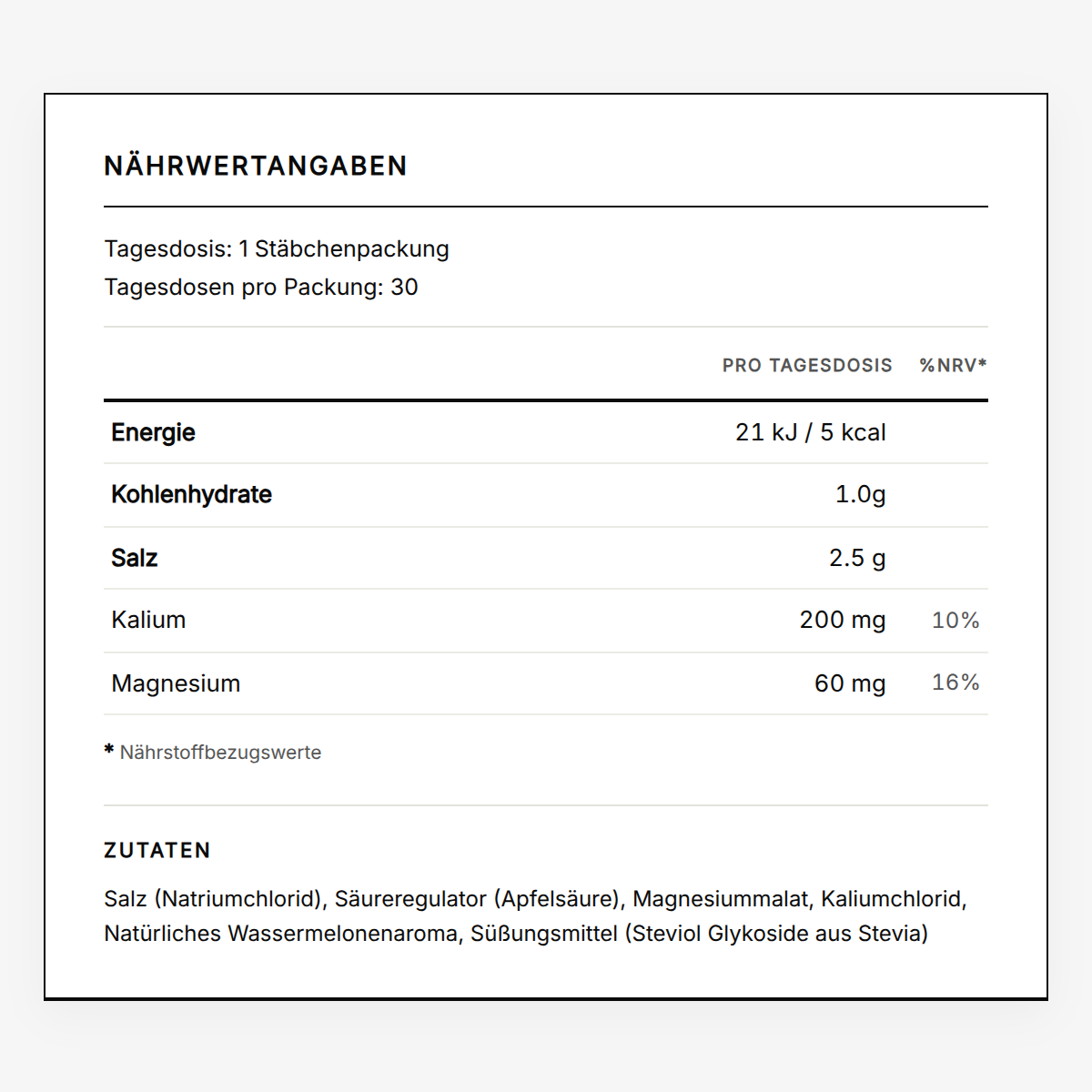
Der Weg zu einer besseren Lebensqualität ist für jeden anders, und Ernährungsbedürfnisse oder Unverträglichkeiten spielen dabei oft eine wichtige Rolle. Deshalb listet jede Produktseite die Inhaltsstoffe klar auf, damit du das Richtige für dich findest. Wenn du bestimmte Allergien oder Unverträglichkeiten hast, sieh dir diese Angaben bitte sorgfältig an. Für eine persönliche Beratung erreichst du unser Kundenservice-Team unter team@healf.de. Bitte überschreite die empfohlene Tagesdosis nicht und bewahre die Produkte kühl, trocken und außerhalb der Reichweite von Kindern auf. Ein Hinweis: Wir sind keine medizinischen Fachkräfte und geben keine medizinische Beratung. Bei ernsteren oder anhaltenden Beschwerden wende dich bitte an deinen Arzt.
Unser Sortiment ist in die Vier Lebensbereiche™ EAT, MOVE, MIND und SLEEP unterteilt. In jedem Bereich findest du die „Bestseller" – die Produkte, die in der Healf-Community am beliebtesten sind. Wenn du nicht weißt, wo du anfangen sollst, ist das ein guter Startpunkt.
The in-page shipment timeline. Every visible string is an override on the block (loginLabel, searchPlaceholder, emptyText, notFoundText) so the copy can be tuned per market without touching code. Which Wonderment account it queries is a market fact, not a block setting.
Block reference
Thin by design: the CMS owns the lead-in copy, the form's own field labels come from Reviewee, and the submission target is wired in code. Nothing here to misconfigure.
The submit-your-brand form. Note the theme setting styles the PANEL, because the background image sets the band's contrast — a background-less brand form also declines the LCP slot for the same reason.
`attachments` toggles the file field. The labels group holds optional per-locale overrides for placeholders, buttons and result messages; each falls back to Reviewee, then to a built-in default.
logoMarquee — label beside an auto-scrolling logo strip
Above: logoMarquee — the press strip from /pages/about-us. Each logo's accessible name is its media alt text, so there's no per-row label field. SVGs render as plain images rather than through the transform pipeline, which does nothing for vector art.
Scroll-driven


Above: scrollSequence — a pinned frame sequence. `markerStyle: dial` draws a clock whose numerals stay upright while the rim turns, and it only appears when EVERY frame's marker parses as a time; anything else falls back to plain progress segments. Markers are rarely evenly spaced, so the dial emits one keyframe stop per frame rather than tweening end to end — a single tween would read 15:00 while frame two says 18:00. `revealOnEntry` opens the stage from an inset card; the stage keeps a margin and a 24px radius throughout, matching live.
pillarStepper — labels that hand over as you scroll
Each step's copy fades in as its label reaches the centre. The band is short on purpose — live's is 324px, about 0.41vh — which is why this is its own block rather than a scrollSequence variant.
Consecutive steps never overlap: the copy fades out over the last fraction of its slice and the next fades in over the first, so no two are ever printed on top of each other.
Zero JavaScript. The whole thing is `animation-timeline` on a shared ancestor, which is why both columns can be driven by one timeline.
Any number of steps works; the keyframes are generated from the count.
arcCarousel — sweep: 80
Above: arcCarousel — the same circle mechanic as the dial, WITHOUT the counter-rotation, which is the entire visual difference: the cards look hand-tilted but each just sits on the rim at `index x angleStep`. `sweep` is how far the rim turns across the pinned scroll. Products come from the shared picker (hand-picked SKUs win) or a collection, resolved through the same path as productGrid; hand-authored cards are the fallback so the rim can carry brands or editorial instead.
Above: productTabs — several named sets, shopper's choice. Not a productGrid variant: a productGrid shows one set, so the tab labels here are translated CONTENT rather than a layout option. A tab whose products don't resolve is dropped rather than rendered as a dead label, and a single surviving tab renders as a plain grid with no strip — which is what you are looking at if only one tab appears. `<product-tabs>` only toggles visibility and ARIA state; it never fetches.
Above: videoWall — one markup, two layouts: a grid on desktop and a scroll-snap row on narrow screens, rather than legacy's second carousel component below the breakpoint. `<video-wall>` is the only script and it animates nothing — it plays a video only while it is on screen and allows at most one unmuted at a time. As everywhere else, a phone gets `mobileUrl` or the poster alone, never the desktop encode.
That's every block. If a block is missing from this page, it's missing from seed-sink-page.ts — add it there and re-run.